Launching the Official Restyling of the Devika Icon and Logo
Devika unveils its restyled logo, marking a significant transformation and aligning with the company's evolving vision and brand identity.
We’re excited to announce that Devika has undergone a transformation and the restyled Devika logo has officially launched!
We’ve put the Devika logo under the microscope to create a more accessible brand. Throughout this process we’ve made sure to capture who we are and what we’re about as a brand. These values include five key concepts that have represented Devika since it was founded in 2016; people, planet, pushing boundaries, prosperity and an open organisation.
Hunting for Easter Eggs in the New Logo
We’ve left a trail of Easter eggs in the new logo and as well as being a bit of fun, they communicate the essence of who we are as a brand.
Computers operate on a binary (base-2) system which uses two digits, 0 and 1, to create, store and disperse content such as image, text and sound.
E.g 01000100 01100101 01110110 01101001 01101011 01100001 means Devika!
Building experiences with technology is an integral part of Devika. As binary code is the foundational language which supports our operations, it has been incorporated in the ‘d’ through the combination of the ‘0’ and ‘1’.
0 + 1 =

The Four Foundational Pillars
The four foundational pillars, prosperity, pushing boundaries, the planet and people, underpin our strategic business decisions here at Devika. Each pillar is represented in the new logo.
People
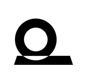
Flip the “d” 90° and you’ve got the first pillar – people. The figure of the head and shoulders represents our commitment to building experiences that contribute to the wellbeing of others.
A perfect example of this value is the Evenness Virtual Reality Sensory Space which provides an environment for people with a disability to regulate sensory responses.
Planet
Take the “d”, remove the “l” and you’ve got the planet. This Easter egg represents our commitment to the natural environment and participation in sustainable practices.
Bushfires recently tore through our beautiful home of Australia with conditions reaching catastrophic levels. This couldn’t be a more obvious effect of climate change and the need for us, as a business, to take responsibility and reduce our effect on the planet.
Prosperity
In order to continue building meaningful experiences, financial growth is essential. While profit is one part of prosperity, we identify prosperity as sustainable growth which includes giving back to the community and contributing to important social issues.
The circle in the “d” represents a seed and the line “l” represents the growth of the seed as it shoots upwards.
Pushing Boundaries
Draw your eye to the white space in between the “i” and ‘k” and you’ll be able to see number 1.
Pushing boundaries is all about staying at the forefront of the industry, seeking out new opportunities in your personal and professional life and keeping number 1 in your line of sight with the aim to be the best version of yourself.

Open Organisation
Instead of working in silos and sticking to what we know in our own department, we’re creating an internal culture that thrives off of collaboration, coordination and applies a cross-functional approach.
This is symbolised in the lower case “d” in “devika” to communicate our commitment to being an approachable organisation that facilitates collaboration within our internal and external networks.